Blogs That Scare Me Away:
Part II.
Part II.
Inspired by Chris Garrett’s question: Does Your Site Frighten Readers Away?, I will evaluate Copyblogger.
I clicked; the main page looked like this:
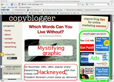
My first instinct was to find the content. It was right there in the center between the navigation and the ads. So far so good!
Next, I focused on the actual content. At the top, I saw an image of a messy assignment written by a student suffering from ADD. Below that was text relating a story I have heard at least twice a year since I was 7 years old.
This blog did not frighten me; it bored me. I thought: get to the point already!
Out of curiosity, I scrolled past 56 introductory words to discover the main point of this blog article. It’s this:
Tags:blog design blogging page layout
If you like my post, please use click orange to subscribe, green to bump or blue to sphinn! Better yet, Stumble using your toolbar. :)
