Think your page layout looks great? Do you have bad eyes and view using a large “minimum font size setting” on your browser? Have you viewed your blog with the “minimum font size” turned off?
I had a rude shock this morning. I always view Big Bucks Blogger in Firefox. Today, I visited using Netscape. Yikes! The real problem was that text flowing around the inline images and ads broke rather oddly and the entire content looked jumbled. Weird text flow and broken ads is no way to make money blogging!
I’ll explain what happened to my, why this happened to me, why it may be happening to you, and also describe how to correct it.
What happened?
Let me show you the sort of thing that can happen. (And mind you, what happened was much worse than I’m showing here. I fixed the problem before taking screen-shots and had to “recreate” the problem at my test blog.)
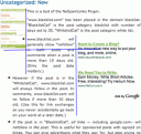
Here are screen shots of a page as it displayed on two browsers; don’t try to read the text, just notice the general layout. For reasons that should become clear later, I added some blue lines to the one on the right.
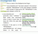
Notice that the screenshot on the left shows the text flowing to the right of the top image. The second paragraph ends very near the bottom of that image. A bulleted list begins; Google ads are to the right of the bulleted list.
This is how I meant the text to display when I composed the article viewing it with Firefox which I had set to force the font size to be at least 16px. I set the minimum pixel size this large because I have bad eyes.
Now, examine the screen-shot on the right. Notice the second paragraph of text stops well before the bottom of the first image. So now, the bulleted text and the Adsense float to the right of that first image. Meanwhile the bulleted text also floats to the right of the Adsense. You’ll also notice, the bulleted text is “squished” between the image and the adSense. Worse yet, the first bullet actually hovers over the first image!
That big black dot to the left of the blue line is not part of the images. Obviously, you don’t want bullets to actually hover on top of images!
Why the layout broke
Do you want to know why this happened? When writing my post, I viewed at 16px. Naturally, I thought I could align the Google ads with the top bullet. So I did! That looked fine to me.
However, my CSS style sheet suggested an 11px font size and Netscape used that suggestion.
Now, it just so happens, 11px is smaller than 16px. When the article is viewed at 11px, the bullet and Google ads ended up above the lower edge of my first image resulting in the “squished” look we see in the second screen-shot.
If I’d edited this viewing at 11px, I would have just shifted the Google ads down solving the problem! Or, if I could get my site visitors to view at 16 px, that would solve the problem. But most visitors don’t want to view in 16px, and it’s silly to try to make them try. I know many will view it in 11px — that’s the font suggested by my style sheet.
How to fix it
Fixing is simple. Even if you normally set your browser to display a minimum font size (and most people over 30 do) be sure to check the display with the minimum font size turned off! To speed the process, I plan to do this.
- When composing my blog entries, I will switch “minimum font size displayed” to the smallest comfortable size I can see. Even though I find 16 px vastly more comfortable than 14px, I’ll switch to 14px when composing posts. I’ll make sure the layout looks “ok” at that font size.
- After writing the post, I’ll switch off the “minimum font size” on my browser and preview the post again. If it displays badly, I will spread the images apart- that is, make sure there is more text between the points where I insert the images. (In my case, I could shift the Google ads down to align with the next bullet point.)
- After that, I can publish with minimal fear that the post will be jumbled on someone else’s screen.
Now, mind you, there are no guarantees on the web. Some browsers let visitors entirely ignore font size suggestions. If someone views my blog at a 6px, the layout is likely to look bad. But by examining with the minimum font size on my browser turned off, I will view the article at the smallest font anyone is likely to use. Because this particular sort of “jumbled layout” occurs only when viewed at small I can be fairly certain it will look ok to almost everyone.
If you do the same, so you can feel confident your layout won’t break either!
In my early days I used to worry about this same issue a lot, taking in to consideration that people who cant see your site right will leave in a couple of seconds.
But using today as an example my server stats combined for all my sites I had 1895 visitors and 87% where either Fire Fox or IE.
So in reality these are the only two that really count.
But I had not taking into consideration font size so i will actually be checking my sites for breakage at higher sizes.
Very good post.
Thanks
It happened to me more than once now. Couldn’t fix it, my fault.. I always use firefox.. when I check my other blog on IE, it was horrible.. couldn’t fix it, I have to change layout..